
Fargo-Moorhead, we have a design problem...
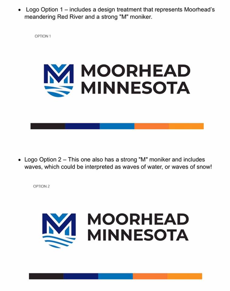
Above are the proposed logos for Moorhead residents to vote on for upcoming usage.
First they came for the ND state license plate, then they went after the state logo, now my hometown is in jeopardy of being handed a poorly designed (and poorly orchestrated) logo.
Backing up, let me just say, that in the current polarizing climate of world events, I admit, this is not imperative news, but since this blog is about my personal design thoughts, it makes sense to post the discussion here.
Let me start by asking this question to city and state leaders in charge of logo designs “Where is your head at when it comes to conversations and decisions about design?” I’m not being facetious, I genuinely want to know about this process so that it can be addressed and immediately remedied.
Wow. I can’t believe these things still need to be brought up, but here we are. The very people that were laughing about ND’s logo are now taking a hit from a TX-firm designed catastrophe happening in their own city, my home city, of Moorhead, MN. Though certainly not as bad as the ND logo, I will say I am not at all impressed with the new identities proposed by the City of Moorhead. Now that my personal opinion is out there, feel free to read on while I deconstruct this, and other design faux pas made by the powers that be. Here are a dozen, or so, of my thoughts…..
Thought #1: Nope. Just nope.
Thought #2: Know your audience - Okay, I get the shield and the double-M, albeit completely unnecessary. I get the colors and reference to water and the river. But is that it? I sincerely hope not, as this does nothing to distinguish it’s unique presence from any other M-word city (ex: Minneapolis, Minnesota, Minnetonka, Mahnomen, etc). Any of these M-cities could be substituted out here and have the same blasé effect as this. What makes the current logo successful and relevant, is that it includes a personality of the place in which it is from. The proposed logos are an uncreative approach to a trendy, flat, semi-minimalist style with nothing that spectacular or unique about it, especially in regards to the place in which it is from. Personally, for a city that constantly wants to side with the progressive part of the state, this logo doesn’t venture far into the creative, adventurous, or risk-taking space I would have hoped for.
Thought #3: Nope.
Thought #4: Why Rebrand? Unnecessary. Like so many organizations, products, and businesses that feel it’s time to freshen up their look, they make the mistake of ruining a good thing. The current logo seems to suit its citizens well and without much complaint. This could have been avoided from a simple public survey, or even online poll. While I do think the current logo could be updated slightly, the overall concept works well and keeps the unique sense of place aspect on par - where else are you going to visit a small city with a viking ship museum?
Thought #5: You got this from WHERE? I’m reminded of an old Pace salsa commercial “New York City!” In this case I mean…”.Texas!” North Dakota, your direct neighbor, just went through this EXACT same ordeal. Why go outside the state and give away (I’ve heard upwards of $10K?) for this mark. There are many (see: MANY!) talented designers in your state and quite a few absolutely killer ones in your city. I would have been much happier to see a firm from the Twin Cities, not to mention a designer from Moorhead itself, take a stab at this, but Texas, c’mon. I’m not going into this too much as people have spoken about this at length in online comments, but something that apparently hasn’t made it past the ears yet of those in charge.
Thought #6: Best case scenario - Please listen to your constituents and all their online comments and submitted remarks. If the majority are not fond of this approach, maybe figure out a way to reconcile the situation. Since you didn’t tell anyone about the fact you were even looking for a logo initially, there was no opportunity for anyone to put in a bid, or be selected to take on this job. Instead, it seems the city just bypassed the people they serve and fast-tracked the plan at the cost of taxpayers. At this point, you can re-instate the old logo and let the people know they’ve been heard and take advantage of all this press and commotion you’ve brought on from the logo discussion and spin it into a story about a city with a lot of love and pride for itself - so much that when pressed to choose a new identity, the response was deafening.
Thought #7: Still, nope.
Thought #8: Double-back plan? Tropicana did it, Gap did it, other brands have done it. They’ve launched a new logo with a new brand message and look, and have met a torch-wielding public that demanded they put their logo back the way it was. While I don’t condone the wielding of torches, I do respect the fact that these brands have passionate and vocal followers. So just like Gap and Tropicana, it might be time to go back to the drawing board and take your passionate constituents’ concerns to heart and make it right.
Thought #9: What’s actually wrong with it? From a design standpoint, a few things, besides lacking it’s own sense of purpose. A logo is meant to uniquely identify - this doesn’t. In addition, I swear that kerning is no longer taught as an important aspect of design. It’s interesting that the top of the background M is a downward arrow. I thought Moorhead was the up-and-coming place to be? Or, is it meant to counter Fargo’s up arrow, used in their North of Normal brand campaign. Why a shield? Is it a gated community, a bank, or community college, all of which are no stranger to these shapes. A city should be open and accessible, not defensive and putting up shield, especially for the progressive stance the state tends to take on political issues. The colors are fine, and I am curious how they will be used throughout a full campaign, but overall, this logo lacks any forward energy, excitement, or pride. ‘Moorhead is on the rise’ is what I’ve been hearing a lot of lately. I think this logo might be a bit of the ceiling to that growth.
Thought #10: I’ll just do it myself. Nope, no way. Not gonna happen. Some things are too close to the heart and home, and are complicated to touch. This, for me, is one of them.
Thought #11: What not to do moving forward. Why not hold a contest? Why not pay fiverr.com for a logo? Why not have school kids design it and we’ll pick the best one? Why not get the mayor’s nephew who used to design things to do it? Why not open up a competition to see which entry is the best? Let me be clear….ahem….THESE ARE ALL TERRIBLE IDEAS for a variety of reasons. Simple solution: Find a designer you trust, or post an RFP for responses, get an estimate, or bid, and let them do their work while allowing for their creative process to lead the discussion.
Thought #12: If approved. Welcome, Moorhead, you can now hang your head with us in on the other side of the river concerned with visual aesthetics, as we move into the future - one that is confusing and nonsensical.
Thought #13: “You’re kind of a downer on Moohread” I’m just critical of my hometown. I, like so many great citizens of MN, are the best kind of concerned citizens. They’re vocal, they care, and occasionally will speak out if something bothers them enough. I love Moorhead and wish the best for my hometown, which is why I’m so vocal about this. It’s also my line of work, so it makes sense I voice my thoughts.
Thought #14: In conclusion….see 1, 3, 7…and….
